
 |
|---|
CONTEXT
EZWIN.CC Product
ROLE
Brand | UX/UI
DATE
Oct 2016 - May 2017
OVERVIEW
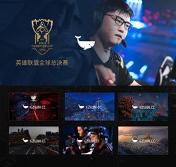
EZWIN allows users to bet / watch vedio on their phone easily and quickly. This is the project I worked on at funplus. EZWIN platform is also funplus first attempt in the e-sports game.
I just joined is a new project, first from the web design, but this project did not yet have a logo, and a complete brand system; So, the project manager and product manager with me to define the name of the project, and then give it to me Design logo for use on websites and mobile browsers
LINK
The Journey
With Product, we aimed to create an effective and enjoyable betting experience on website and mobile. First I was assigned to my responsibility to design the brand logo at the zero phase.And then I with another designer designed the website and mobile page design, and they were simultaneously in parallel. I really enjoyed the process of designing a product from scratch, since it gave me the opportunity to contribute my ideas to the product at a more fundamental level and witnessed the evolution along the way. We had two-designer team working closely with product managers on requirements, discussing feature flows, and refining the proposed design. We also communicated with developers directly to ensure the consistency between the design and the final deliverable.
Team Project Manager *1 / Product Manager *2 / Visual Designer *2 / Front-end Engineer *3 / Back-end Engineer *1/ Test Engineer *1
My Role
Logo Brand Design
Visual design of wap and website homepage&other interface
Define visual specifications
Construct and conduct research with Front-end Engineers
Responsible for designing some operational activity pages

Workflow
Brand
I just joined is a new project, first from the web design, but this project did not yet have a logo, and a complete brand system; So, the project manager and product manager with me to define the name of the project, and then I will Design logo for use on websites and mobile browsers


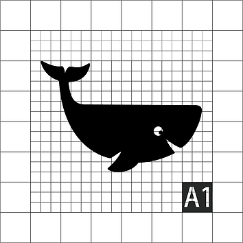
Design idea: I mainly focus on keywords such as "game", "whale entertainment" and "event", so as to highlight the image of product business and gaming and try to design logo. During the discussion with the project leader, the opinions were biased in the direction of "cetacean (fish)" homophonic sound, and at the same time, they hoped to be concise in their modeling and also put forward the key word of "conciseness" so that the user could feel the whole Product tonal.

 |  |  |  |
|---|
Typography and color theme


INTERACTION DESIGN
The team first came up with the user stories to summarize the key features of the product:
- Organize: Designed with a rasterized layout, the tool will sort all files systematically and display them beautifully.
- Collaborate: team members can access these files anytime, anywhere, while keeping cloud updated and iterated.provide feedback, evaluate on submissions before making the final call.
And then based on the key features, the wireframe screens and clickable prototypes were made with Sketch and InVision respectively. It went through two rounds of iteration with internal and external testing.

Example of the wireframe screen
VISUAL DESIGN
The goal of the visual design is to turn the wireframe into high-fidelity visuals for presentation, creating the product demo video and the reference for development.
The website design style is based on dark colors, which mainly gives the user a sense of immersion.


 |
|---|
Key Pages
CURRENT STATUS
My biggest takeaway from this project, apart from sharpening my design, was the taste of entrepreneurship. I've gained hands-on experience about how to bootstrap user, make rapid progress in a small team, and keep iterating the strategy and product thorugh repetitive testing and validation.
We uses their feedback to identify the key functionalities, prioritizing the implementation of the tasks and keep refining the design of the user experience. More information can be found on ezsport.cc.